Farrah Floyd is probably one of the designers which arouse curiosity from the moment on you hear her name for the first time, be it because of the name of her eponymous label or because of the very expressive titles of her collections Heroine and Contrasts.
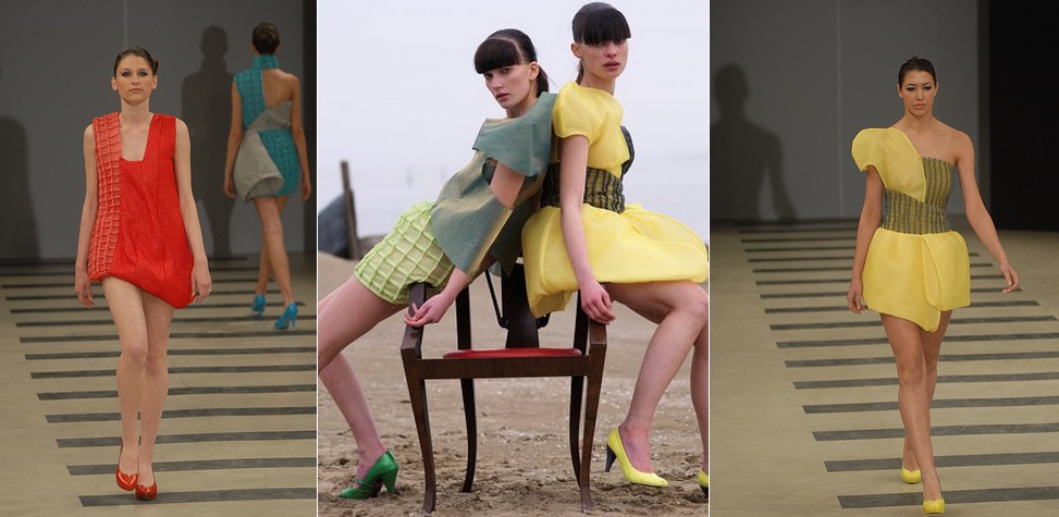
While Heroine is marked by a color palette dominated by black and white and therefore is defined by a rather casual character, the collection Contrasts represents a dramatic and simultaneously mundane collection which underlines the female charms in a very vintage way. Asymmetric, summery one-shoulder dresses in a sunny yellow let the wearer shine just like the luscious red nuance of a short dress, which is characterized by a voluminous cut. The diversity of materials is another attribute which lends the collection by Farrah Floyd excitement and adds additional contrasts.
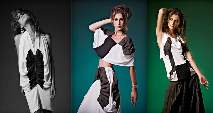
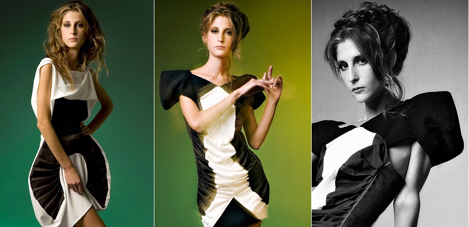
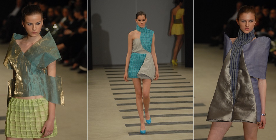
After we received an insight into why these previous collection received the name Contrasts, we should take a closer look at Heroine. Unlike what I initially expected, no dark and mystical atmosphere awaits me and no seductive violet can be found here. Instead, an interplay between black and white which is probably as contrasting as the fashion line Contrasts unfolds in front of my eyes. The floor-length skirts and pants are only topped by the virtuously incorporated pleats and the geometric playful patterns which rise from the interplay between black and white.
What Farrah Floyd is going to present at the Berlin Fashion Week in the Hotel Adlon in the Greenshowroom is still a secret. But we are really looking forward to see what inspired the talented designer this time. Can’t wait to see her collection for 2015.
Copyright and Source: http://www.farrahfloyd.com/ and http://green-showroom.net/