(Please, scroll down for the English version)
N°21 ist tatsächlich ein etwas schräges Ready-To-Wear Label. Für den Sommer 2014 macht
N°21 vor praktisch keiner Farbe Halt. Schwarz und Weiß bilden dabei zwar die Eckpfeiler, dazwischen findet man aber viele verschiedene Rosatöne, Blau und auch ein dunkles Jägergrün.
N°21 hat zwar auch einen floralen Print in der Kollektion untergebracht, doch liegt die Begabung doch eher bei den Stoffbearbeitungen, welche für Frühling und Sommer 2014 auch wieder zahlreich und verschiedenst zum Einsatz kommen.
Das Schräge dabei ist wohl die Anordnung dieser Verzierungen. Ein Kleid, welches wie eine Kombination aus Bluse und Rock wirkt, ist im Rockteil nur auf einer Seite üppigem Faltenwurf verziert. Er sticht frech ab und bringt eine Asymmetrie in das sonst sehr geradlinige und locker geschnittene Outfit. Einfach irgendwie schräg.
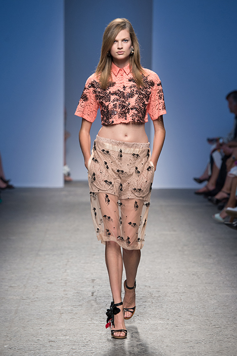
Die Designs selbst sind generell dezent und geradlinig geschnitten. Sie erhalten erst durch die aufwändigen Verzierungen ihren unwiderstehlichen Charme. Die zu kurz geratene Bluse, die den Bauch keck entblößt aber mit kurzen Ärmeln die Oberarme bedeckt und hoch zugeknöpft werden kann, wirkt überaus straight und kantig. Nur durch ihre Farbe und die schwarzen floralen Ornamente erhält sie eine sehr feminine Note. Auch der Rock dazu ist ähnlich gestaltet.
Er ist beige und durchsichtig und mit einer Hose darunter kombiniert. N°21 soll wohl erst ab 21 erlaubt sein, weil sie mit ihren Asymmetrien und der gewagten Transparenz die Jugend verderben könnten? 😉 Nur gut, dass es keine Altersbegrenzung für Kleidung gibt.
Bild- und Informationsquelle: http://www.numeroventuno.com/


English version
N°21 really is a kind of crazy Ready-To-Wear label. They decided to use any color they can find and come up with for the summer 2014. Even though black and white are the main nuances here, you’ll also find different pink dyes, blue and even dark green. N°21 also has a floral print in the collection, but what really makes the label so unique are the way they work with cloths, which again are used in diverse ways for spring and summer 2014.
The weird thing about all this is how the adornments are aligned. A dress that seems as if a blouse and a skirt have become one, has an elaborate drapery on only one side of the skirt. It looks cheeky and gives the straight and casually cut outfit an asymmetric structure.
Generally the designs have subtle and straight cuts. The elaborate adornments make them outstanding and give them their irresistible charm. A blouse that looks like it is a bit too short lets the midriff friskily peak through also has short sleeves that only cover the upper part of the wearer’s arms, can be buttoned up to the neck. This gives the blouse a really straight and squared effect. It is the color and the black flower ornaments on it that finally give it a very feminine note. The skirt that is worn with that blouse has a similar style. It’s beige and a little transparent and worn with a pair of trousers. I guess N°21 is supposed to mean that there clothes are only for the ladies who are above 21 years old, because the asymmetry and the daring transparent cloths could corrupt the young fashionistas among us. 😉
Image Copyright and Source: http://www.numeroventuno.com/